Mixed Media ATCs and Design
We began a 2-week project in ATC class: Mixed Media ATCs! Students created wonderful little drawings on their watercolor ATC cards, then set about painting them with watercolors. Some students chose to use traditional watercolor palettes for their work, while others used watercolor pencils followed by wet brushes. Next week we'll add a second (or third! or fourth!) medium to finish the little jewels!
Ceramics I and II students received some bisque-fired wares back this week. Right now we're in "Production Mode" in ceramics classes, so I won't be posting many photos. Near the end of the semester, though, when we've had an opportunity to glaze or paint the works, pictures will be posted!
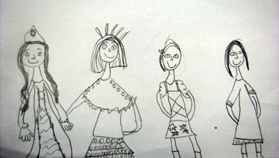
Anais' design features symmetry and balance. The mood is certainly happy!
Design was the topic of this week's Explorations in Art classes. All of the classes leading up to this were in preparation for this week's lesson. While touring the gallery, we discussed the myriad components that artists consider when designing a work of art. Students pointed out the more obvious design choices of the featured artist's work.
Edward Hicks' The Peaceable Kingdom, c. 1834, has a strong theme of "peace" and employs mostly a warm color palette. The mood is calm and peaceful.
Elements that make up design can include, but aren't limited to: Use of space, theme, line, color, symmetry, asymmetry, mood, light and shadow, perspective, pattern, balance, repetition, proportion, etc. Even a title can become or can influence a design choice.
The Child's Bath, 1893, by Mary Cassatt has a very calm and soothing mood, with a mostly cool palette. Cassatt put a lot of pattern into this work.
We compared and contrasted the ideas of balance and symmetry, and discussed how a work of art can be very balanced while not necessarily being symmetrical.
Of particular interest was assigning a "mood" to each work of art, and identifying design choices the artist used to convey that mood.
Rosa Bonheur's The Horse Fair, 1853 is very balanced in the way the subjects gallop across the midline of the painting, and also in her use of cool and warm colors. Her painting evokes a sense of excitement and, with the rearing horses and oncoming storm, also a touch of possible danger.
And, of course, we learned some very interesting things about the artists featured in this week's gallery tour. For instance, we talked about Edward Hicks' theme of "peace," and how his life as a Quaker, and therefore a pacifist, would compel him to paint a scene such as the one in The Peaceable Kingdom . . .
Victorian Parlor II, 1945, by Horace Pippin is very symmetrical and has a great deal of pattern. His painting is very still and calm. Students decided that the occupants of his painting were tidy, and were also "very old; probably even 50 years old or older!" :)
. . . and how Horace Pippin was a self-taught artist! We noted the lack of perspective and proportion in his work, but marveled over his use of pattern and symmetry.
We talked about Mary Cassatt's travels to France, where she first encountered Impressionism, and then later returned to the States where she gained fame as one of the first American Impressionists.
Scary, screamy, and anxious! The Scream, painted by Edvard Munch in 1893 evoked some fairly dark "mood" words by students, though almost all of them admitted to really liking this particular work! The strong diagonal lines which seemingly cut through the central figure, the strong swirling colors, and the expression and rendering of the "screamer" all help to create and enforce the mood.
And most students quickly identified Edvard Munch's The Scream as a very famous painting. Easily half of the students also knew the title! Students: Do you remember the proper way to pronounce Munch's name? :)


