Posts

Showing posts from October, 2010

Mixed Media ATCs and Design
Image
We began a 2-week project in ATC class: Mixed Media ATCs! Students created wonderful little drawings on their watercolor ATC cards, then set about painting them with watercolors. Some students chose to use traditional watercolor palettes for their work, while others used watercolor pencils followed by wet brushes. Next week we'll add a second (or third! or fourth!) medium to finish the little jewels! Anais' design features symmetry and balance. The mood is certainly happy! Design was the topic of this week's Explorations in Art classes. All of the classes leading up to this were in preparation for this week's lesson. While touring the gallery, we discussed the myriad components that artists consider when designing a work of art. Students pointed out the more obvious design choices of the featured artist's work. Edward Hicks' The Peaceable Kingdom, c. 1834, has a strong theme of "peace" and employs mostly a warm color palette. The mood is calm and peace

Mrs. Graves' art classes, 10/25-10/29

Pottery I - Some of you are getting very far behind, your absences or late arrivals are really hurting you. Remember, if you miss a class, that time is supposed to be made up before or after school or during a learning lab time. If you come in late you are missing important instruction. This week: All 3 groups are taking the MID-TERM TEST on Thursday!! Study your terminology folder notes. Group A: You are working on your slab containers, the sides should be leather hard and you should attach them the first part of the week. Make sure you seal the inside corners with a coil and seal the outside seam by smoothing the clay. After the sides are together roll another slab for the base; cut and attach by scoring and slipping. After everything is attached you need to BURNISH, use the back of a spoon to compress the leather hard clay to a smooth, shiny surface. Make sure the corners are sharp and straight. Pay close attention to the lip, smooth and shape as you burnish. Group B: You are on the

Perspective, Vanishing Point, and Space

Image
Small format "Favorite" drawing was the theme in ATCs, ACEOs, and Art in Miniature this past week. Working in a 4" x 6" space, students created 4 different drawings during class time. Each drawing represented a favorite thing in their lives. Space was the subject in Explorations in Art. We toured the gallery and discussed how famous artists such as Millet, Seurat, and others used perspective to create a sense of space. Students learned about both linear perspective and aerial/atmospheric perspective . The Gleaners , 1857, by Jean-Francois Millet. Oil on Canvas. Young artists learned the meaning of a vanishing point , and how this is used to create perspective in a work of art. We talked about how the two (vanishing point and perspective), working together, tell the brain that the artwork makes sense. For instance, objects that are closer appear larger and more detailed than those farther away. Wheatfields , c. 1670, by Jacob van Ruisdael. Oil on Canvas. Students to

Chiaroscuro!

Image
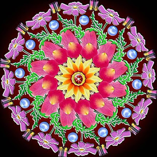
In ATC class this past week we finished up our "mini mandalas," and they're absolutely BEAUTIFUL! Students titled their works, and these will be mounted and labeled for the end-of-semester Art Show.   Rembrandt's Old Woman Cutting Her Nails , c.1665-1660. Oil on canvas.  We learned all about the relationship between Light and Shadow in Explorations in Art. After a discussion about the various sources of light, both during the day and at night, we toured the gallery to discuss the works on display. Students took turns using the "portable Sun" to identify the position of the light source in each work.   James Chapin's Ruby Green Singing , 1928. Oil on canvas.  This was a little trickier than they thought it would be, but we had a lot of fun (and some coaching!) figuring out each work of art. We discussed the way artists use Light and Shadow in their works to convey a sense of volume and to create a mood.   William Harnett's The Old Violin , 1886.   We

Line

Image
Photo of Objects Basic Contour Drawing Repost of Basic Contour Drawing Contour Line Drawing Repost of Contour Line Drawing Cross-Contour Line Drawing Repost of Cross-Contour Line Drawing Slow Contour Line Drawing Repost of Slow Contour Line Drawing Quick Contour Line Drawing Repost of Quick Contour Line Drawing Implied Line (left) Quick Contour Line (right) Blurred Line (both) I have fun trying this line style out. The one on the left is the second one I  tried and felt most comfortable with. Quick Contour Line (left)  Lyrical Line (right) Implied Line (left)  Cross-Contour Line (right) Implied Line (left) Quick Contour Line (right) Cross-Contour Line... was not very easy for me to do and still wondering if I did it correct. Implied line (left)  Whimsical line (right) structural lines (left) was fun to try. Quick contour line (right) is always fun to use.

Mr. Briscoe Visual Arts – 01/10-14

Image
Visual Arts Over the last few weeks our visual arts class has been discussing two major concepts: line and value. We discussed line as the basic structural element of any drawing. Students have done gestural and contour line drawings to explore the raw nature of line. Recently we have been focusing on value and its role in creating the illusion of reality and depth. Value is defined as the relationship between dark and light. Students discussed two different types of value: flat value and graded value. Flat value is a single tone while graded value is the subtle shift between dark and light tones. See example below: FLAT VALUE GRADED VALUE Students have been working on a Ribbon Project that deals with depth, overlapping and the effect that a single lightsource has on an image. The rubric for this project is below: Ribbon Drawing 1. Student demonstrated basic knowledge of drawing ribbons with depth and overlapping – 15 pts. 2. 2. Student used value according to the light source – 15 pts

Mr. Klausing's Classes

Week of October 18-22 Drawing I Drawing I students have their still-life drawing due on Monday, Oct. 18th. During the week of October 10-14, Drawing I students began working on perspective drawing in their sketchbooks. Students drew 9 forms in 1-point perspective and 9 forms in 2-point perspective. We also identified different parts of 1-point perspective in photocopies of LSW building areas. On October 29th, students will be turning in sketchbooks with all activities done over the past three weeks. On Thursday, October 14th, students went outside to sketch and photograph different compositions from around the building. These sketches and photos will be developed into a project drawing over the next several weeks. If you have any unfinished sketchbook work, you need to have those completed and turned in by October 29th. Painting II Students completed and turned in their Expressionist self-portraits on Thursday, October 14th. After this project, students completed an intensity/v

Mrs. Graves' class 10/18-10/21

Pottery I- We are still working in 3 separate groups, eventually everyone will get their chance to work on the pottery wheel. Group A- You are beginning your slab containers. By the end of the week you should be connecting the sides using one of the 3 techniques taught in class. Don't forget to score and slip and also place a coil in the inside corner to make sure the corner is joined permanently. Begin burnishing when everything is connected. Group B - You are on the wheel! Remember, you must create one cylinder and one bowl to be graded. The dates have changed, you are throwing until 10/27. You are not throwing on the half days. Group C- You are working on your themed coil pots. Remember to score and slip each layer. If your slab containers are not finished yet, they must be in by Monday. On the half days we are going to update our notes in the terminology folder to prepare for the mid-term exam coming up. We will also be doing some mid-term cleanup, going through supplies and cl

Mr. Rice's Classes 6 Weeks

Foundations of Design: Students are working on shading techniques. Value Scales will be created so students can refer back to compare values on their drawings and designs. Value design: Taking simple patterns and designs and creating graded value to create depth. Hand Drawings have just been turned in. Students draw from life working from worksheets and continue onto drawing from life and shading. Students are drawing bottles from life right now in class. Visual Art: Students are working on Shading techniques. Students created value Charts as guides for future projects. Students created radial designs using symmetrical balance, then using graded value in color to create depth. Students are working on drawing from life drawing hands. Students are painting the background using watercolors. Graphic Design: Students have created textile designs using adobe illustrator. Students created Olympic Pictograms representing Olympic sports. Students used artist Catalina Estrada a

Mini Mandalas, Form, Artist Stamps, Etc

Image
In ATC and Art in Miniature, we began a 2-week project creating miniature mandalas . After discussing some of the qualities of the mandala's design--particularly symmetry and repetition--students created detailed drawings and, afterward, began adding color. Once these are finished, each student's work will be titled and exhibited at the end-of-semester Art Show. Form was the subject of the past week's Explorations in Art class. We talked about form in art, and particularly form in sculpture. We learned that sculpture is displayed differently from 2-dimensional art, because sculpture is intended to be viewed in the round . Flying Horse, One Leg Resting on a Swallow , Bronze. 2nd century CE from Wu-Wani, China We also reviewed what we've already learned about direction (vertical, horizontal, diagonal) and identified the implied movement, or lack thereof, of the works under discussion. Students learned about the " lost wax " method of creating sculpture. Auguste

Value

Image
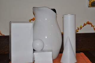
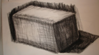
VALUE Rectangle Cube Ball Cone . Cylinder Sketch 1 done with pencil Sketch 2 done with pencil Final drawing in compressed charcole. Phone of still life object as I drew them. I was a a slightly different angle then this photo was taken.